

Most web design trend lists are written for agencies and brands with budgets to match. This one is written for the five-person business whose website has one job: turn a stranger into a phone call before they look at anyone else.
Search for web design trends 2026 and you will meet glowing gradients, bento grids and chatbots. Skip almost all of it. A UK guide updated this month argues that what actually wins work are the plain things: real photos, fast pages, clear prices and pages that answer real questions. Its summary line is the whole story. Customers now judge a business on a phone, in seconds, often after reading an AI answer first.
Here is what that means in practice, and a one-hour check to see how your site measures up.
Customers read an AI answer before they find you
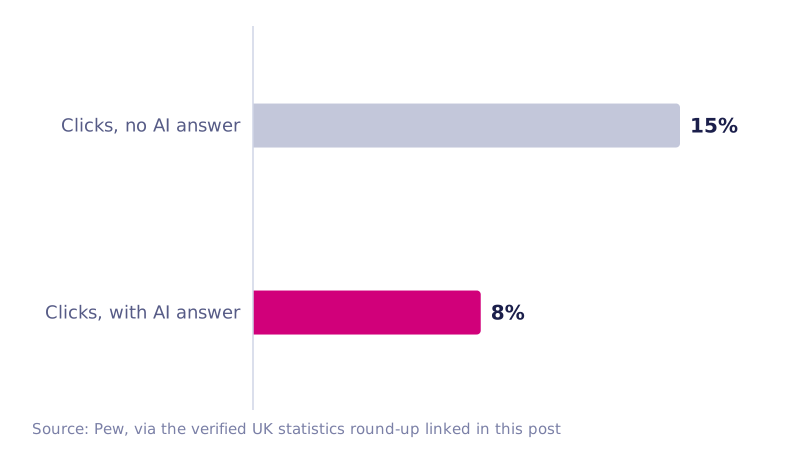
Google now shows AI summaries above many results, and the UK has had AI Mode since July 2025. The click you used to win mid-search happens less and less. When an AI summary appears, US research by Pew measured clicks falling to about 8% of visits, against 15% without one. UK analysis puts AI summaries in roughly 30% of keyword searches. Both figures come from a verified round-up of UK small business website statistics that traces every number to its original page.
The consolation is intent. The people who still click are close to buying. They have read the summary, they are building a shortlist, and they arrive wanting one thing: quick proof that you are real, local and good at the job. Your homepage is no longer competing for attention. It is settling a trust question in a single glance.
Real photos beat polished ones
AI image tools made glossy photography free, which is exactly why it stopped impressing anyone. Visitors scroll straight past a stock team and a spotless, AI-rendered interior. They stop for your van, your people, your premises and the job you finished last week.
A recent-jobs section does more work than most redesigns. Six real photos from the past month, each with the town and a one-line description, is proof. Reviews with first names and towns are more proof. So are the unglamorous details: a real address, a named owner, a Companies House number. "Your trusted partner" written over a smiling stock model gives people nothing to hold on to, and gives an AI answer even less.
Thumb-first, not just mobile-friendly
Mobile friendly is the floor, not the finish line. The sites that win work in 2026 are designed for a thumb. In practice that means:
- A call button that stays visible on every page without scrolling, with WhatsApp alongside it if your customers use it.
- Contact forms with three to five fields, and the right keyboard for each one.
- Five menu items or fewer.
- Opening hours and the areas you cover, visible without much scrolling.
Google indexes the mobile version of your site for ranking, so whatever is hidden or broken on a phone might as well not exist. Check on a real phone, held in one hand.
Speed people can feel
Fast sites read as trustworthy. Slow ones read as abandoned. The Core Web Vitals numbers give honest targets: main content showing within 2.5 seconds, taps responding within 200 milliseconds, and no jumping about as the page loads. On small business sites the usual culprits are oversized images, sliders, too many plugins and cheap hosting, and most can be fixed in a day. This is the cheapest trust you will ever buy.
Write pages an AI answer can quote
AI summaries pull facts from websites, so pages that state facts plainly have a chance of being quoted. Slogans give an AI nothing to work with. "Quality heating solutions" loses to "we fit boilers across Romford, Hornchurch and Upminster, usually within three days" every time.
Try this. List the ten questions customers ask on the phone. Answer each one on your site in two or three sentences. Add a short FAQ to every service page, and keep your name, address and phone number identical everywhere, including your Google Business Profile. For the layer machines read deliberately, see our plain guide to schema markup.
Clear from-prices, one obvious next step
Customers hate guessing. Show "from" prices, simple packages or at least a range. That filters out the time-wasters and reassures the serious ones. Then give every page one obvious action: book a survey, get a quote in two minutes, call now. One page, one action. A page with three competing buttons has none.
Online booking keeps growing where visits are fixed and bookable, such as salons, clinics and MOT slots. If that describes your trade, put the calendar where people can reach it.
Accessibility is just design now
The current standard, WCAG 2.2, dates from October 2023, and the Equality Act 2010 already expects service providers to make reasonable adjustments for disabled people, including on their websites. Automated testing recently found detectable failures on 95.9% of homepages, with low-contrast text the single most common error. Good contrast, readable text and properly labelled forms also help anyone squinting at a screen in bright sunshine. Do this properly and you are ahead of most of the web, and your site is probably faster too.
What to ignore
Not every fashion deserves your money. Sliders, auto-playing video and auto-scrolling banners distract people and slow pages down, and almost nobody watches them. Heavy 3D animation is worse on phones. A chatbot that cannot answer or book anything frustrates people more than a plain form. The 2026 look is calm: big readable headings, generous white space, one strong brand colour and very little moving.
A one-hour check on your own site
You do not need a rebuild for any of this. Open your site on your phone and work through:
- Time how long the main content takes to appear.
- Check a call button is visible on every page without scrolling.
- Replace three stock photos with real ones from your own work or team.
- Add your towns, opening hours and a from-price to your main service page.
- Write five questions customers actually ask and publish them as an FAQ.
- Delete any slider, auto-playing video or scrolling banner.
- Check your name, address and phone match the details on your Google Business Profile.
- Test your contact form, then confirm the email actually arrives.
Most owners find enough to fix on that list to cover the cost of the coffee.
Fix first, rebuild when it is cheaper
Nearly everything above is content and speed work, not a redesign, so patch before you rebuild. A rebuild earns its keep when the site is more than five years old, slow on phones, or so awkward you quietly stopped updating it. That last one is how websites stop producing enquiries.
If you do rebuild, settle on a price range first, because quotes vary wildly. We have written plainly about what a small business website should cost in the UK. And when you want a quick read on a single page, our free assessment is an instant, automated 60-second audit of one page, covering ten checks. It is not a personal review or a conversation, just the results.
After that, it is a question of stewardship. New photos monthly. FAQs refreshed as the questions change. Prices updated before anyone notices they are wrong. That quiet maintenance is what keeps a site built this year still winning work in 2028.